Monday, 1 October 2012
Homework - male gaze
Ok,
1. Have a look at the following :
http://www.youtube.com/watch?feature=player_embedded&v=QA-ksOHP0bY
It's a scene from Apocalypse Now, a classic movie.
Deconstruct the scene and think how Mulvey's work relates.
For example, how are both men and women shown?
What are the instincts / ambitions of the men in the audience (and the cinema audience)?
How are the women shown?
What effect does the lighting have on the scene? Does this reinforce any of the comments or points you've made?
What is the fetishistic gaze? Is it relevent?
Are women exploited - what do you think?
What are the connpotations with only male voices being heard?
Try and write this as an essay - email it to me, but also add it to your blogs.
Monday, 24 September 2012
Look at these...
Look at this / these...
http://xfinity.comcast.net/slideshow/music-groundbreakingvideos/1/
http://whatculture.com/film/6-groundbreaking-films-that-redefined-their-genres.php
http://www.ifc.com/fix/2009/06/50-greatest-trailers
Laura who?
Homework and lesson time:
Make sure you have decided on a song / genre / sub genre
Look at (or try to find) benchmark videos from the genre
What does Laura Mulvey have to say about where viewers look... Crypic I know, but think how her views on the male gaze can be interprited by you in your own work.
This is true for music vids and trailers... What draws a viewer's attention to a text et cetera.
Monday, 10 September 2012
A2 start
With the short film / trailer option, make sure you think about your effects.
Obviously there's not the Hollywood resources to hand, but there's loads of cool stuff you can view and learn...
If you're doing horror, buy some liquid latex and have fun experimenting with effects, below:
http://www.youtube.com/watch?v=SzC85Tm-fMY
Link from that to other ideas to get you started...
If you're doing music video, there's nothing stopping you putting the whole band in some sort of makeup too!
Remember... Research your genre, PLAN your ideas to the n'th degree and have a really clear plan in what you want to achieve.
Plan, check, revise, repeat...
Friday, 20 July 2012
holiday work
Write up your blog...
What I learned about...
1. Scripting
2. Storyboarding
3. Locations
4. Planning
5. Organisation
6. Teamwork
7. Editing - transitions and sound
8. The final produc... Two stars and a wish... Just like in Year 7 :-)
Friday, 13 July 2012
Using Beat Markers in iMovie 11 (MacMost Now 479)
This will help you with your music vids. Beatmarkers are important - so have a look and try and apply the techniques.
http://www.youtube.com/watch?v=956afqCwryg
http://www.youtube.com/watch?v=956afqCwryg
Friday, 29 June 2012
Groundbreaking or OMG
You can decide on this...
Is it a music video or a cookery show?
Bricolage?
Homage?
Parody?
Just what is it and what do you think of it?
It's certainly original but does it work?
Did you turn it off / not get it / hate it/ laugh at it / think it hit its target demographic?
http://www.youtube.com/watch?v=CeZlih4DDNg
All yours...
Have fun - and post a thought underneath...
Wednesday, 20 June 2012
Friday's Lesson: Street Spirit (Fade Out)
Check out the video below.
Below is the background info on the track...
Have a scan through and look at the level of detail... Look at one of your own, favourite, videos and research it. What is it about? What do YOU think it's about? Who directed it. What else did they direct? Are they as good? Is the directer affieliated to a specific band or label?
http://www.youtube.com/watch?v=IrTB-iiecqk
"Street Spirit (Fade Out)" (commonly referred to as "Street Spirit") is a song by Radiohead, featured on their second studio album The Bends, which was released in 1995. Noted by singer-songwriter and guitarist Thom Yorke as "one of [the band's] saddest songs" and describing it as "the dark tunnel without the light at the end", "Street Spirit" was released as the band's ninth single and reached number five on the UK Singles Chart, the highest chart position the band achieved until "Paranoid Android" from OK Computer, which reached number three in 1997.
Yorke has suggested that the song was inspired by the 1991 novel The Famished Road, written by Ben Okri, and that its music was inspired by R.E.M.
The black-and-white music video for "Street Spirit" was filmed during two nights in a desert just outside Los Angeles. It premiered in February 1996 and was directed by Jonathan Glazer, who said, "That was definitely a turning point in my own work. I knew when I finished that, because they found their own voices as an artist, at that point, I felt like I got close to whatever mine was, and I felt confident that I could do things that emoted, that had some kind of poetic as well as prosaic value. That for me was a key moment." Glazer would later direct the video for "Karma Police".
Youtubers commented:
For me, this song could have had two meanings- firstly, it may have been a statement on the absolute despairs of depression- the sense of disconnectedness, the warped sense of detachment and time, where things happen about you but you're uninvolved- a sense that time around you is moving slowly; unresponsiveness and dull noir.
Secondly, everyone within this clip is trying to be beautiful in some way; but attempts of liberality fail, and they fall to the ground. They attempt to ascend, but fall.
Friday, 15 June 2012
Today's lesson recap
Here's a list of the stuff we watched today. Have fun watching them again - but there are some pointers on here which will help you with your blogs.
There's also questions at the bottom - make sure you've addressed them in your blog :-)
The Exciters - Tell Him
http://www.youtube.com/watch?v=T71MxSJl1OQ
One Direction - What Makes You Beautiful
http://www.youtube.com/watch?v=QJO3ROT-A4E
Look at the similarities beween the two. What do they have in common?
Look at the parody...
Blink 182 - All The Small Things. (Remember this was done in 2000... Twelve years before 1D...)
http://www.youtube.com/watch?v=9Ht5RZpzPqw
Also look at genre and the tropes associated with each.
Rock / Metal / Rap
Limp Bizkit - Break Stuff
http://www.youtube.com/watch?v=ZpUYjpKg9KY
Funkdoobiest - Bow Wow Wow
http://www.youtube.com/watch?v=qF0MoFX93G0
Beastie Boys - Sure Shot
http://www.youtube.com/watch?v=JhqyZeUlE8U
Also look at some of their other vids (and research directors associated with them) for more conceptual work.
Iron Maiden - The Trooper
http://www.youtube.com/watch?v=4uq6Ax-zzkQ
Concept vids:
Ok Go - This Too Shall Pass
http://www.youtube.com/watch?v=qybUFnY7Y8w
Fatboy Slim - Praise You
http://www.youtube.com/watch?v=Ex1qzIggZnA
Fatboy Slim - Push The Tempo
http://www.youtube.com/watch?v=so9DBHCo64Q
Other stuff...
Feeder - Just A Day
http://www.youtube.com/watch?v=3wzqGI_4fIM
Think about what types of video this is... It's sort of performance, sort of concept, how would you classift it and why does it work (or not!)
Electric Six - Content advisory on most of their work, but very good narratives.
Daft Punk - Around The World (award-winning concept)
Dance.
Beyonce - Single Ladies
http://www.youtube.com/watch?v=4m1EFMoRFvY
Compare to
Justin Timberlake - Rock Your Body
http://www.youtube.com/watch?v=TSVHoHyErBQ
Blog what you've found out about the conventions of music videos.
Have fun :-)
Monday, 11 June 2012
Welcome back
Welcome back to everyone! Hope you're all ready for the term ahead after your break.
Not even had a lesson yet and the homework is set!
So... In preparation for Friday... Make sure you've set up your new blog. Also, post in to it your top three music videos (the YouTube links are fine) and say why you like them - remember, it's not about the song, it's about the video.
Have fun and I'll see you Friday.
Thursday, 19 April 2012
shadowing text help
Shadow text.
If you're concerned about pages looking too flat, you can add shadow to text.
Obviously, don't overdo this - sometimes less is more - but it can be used to make a page, and certainly a headline, more aesthetically appealing.
I've done a step-by-step guide for those of you who want to experiment...

Create or open a document and select some text, in this case, it's The Bike Hugger Mobile Social.
2. Open The Inspector

Click the Inspector button or View>Show Inspector (or press Option-Command-I).
3. Switch to the Graphic Inspector

You’d think that the trick would be to bring up the Text Inspectorin the Inspector but really you want to bring up the Graphic Inspector as that’s where the tools are for stroke, shadow and opacity. Pages considers a bit of text with an effect to be just like a graphic element.
4. Control Your Shadow

Click the Shadow box and change any of the settings you want to get your desired effect. The first box controls the color (black usually works best, who has ever seen a shadow that’s not black?), while Angle controls the angle of the “light” that makes the shadow (you can use the circular tool or enter a number in the numeric field to the right). Offset controls how far from the original text the shadow lies, while Bluris the amount of blurring applied to the effect, and Opacity is the degree to which one can see through the shadow.

Comment comment comment
Ok. I've posted on a couple of blogs (Alice W and Jade) with comments for their projects, but they apply (in part) to all of you.
What I want you to do is read through the comments, make sure you look at what I'm saying and then pick someone else's pages to be critical on. Find the faults and constructively criticise them. It will help you with your own projects, but also help others too.
Finally - keep up the good work! The end is in sight!
Thursday, 29 March 2012
Dropping caps help and advice
Dropping Caps.
This is quite a regular convention for magazines, especially on the more text heavy features (like DPS). Sadly, you can't do this directly through Pages - but you can still achieve the same effect.
A dropped cap (short for dropped capital) is where the first cap letter of a paragraph is (usually) heightened to between two and five lines of body text. It can also be in a different font and is a way of splitting the copy up.
I've included a rough guide on how to do it manually in pages - but, as with all good designs, be careful not to over-use them.
Think as well about how you can break up text in the body of an article. Newspapers use crossheads (especially the red-top tabloids) whereas magazines use boosed boxes (or buttons, or skyboxes depending on house style) to make the better quotes stand out.
Anyway, here's a step-by-step guide for producing drop cap effects in Pages for you.
1. From the Pages toolbar or from Insert, choose Text Box.
2. Replace the words "Type to enter text" with the capital letter of your choice.
3. Highlight the letter that you've added and choose an appropriate font and size. Doing so will probably involve some trial and error.
4. Left-click outside and then inside the text box to show its borders.
5. Resize the text box. Here too, expect some trial and error.
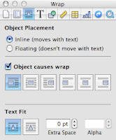 6. With the borders of the text box still showing, open the Inspector (from the Pages toolbar or from View > Inspector) and choose Wrap Inspector, the third icon from the left.
7. For Object Placement, select "Inline (moves with text)."
8. Check "Object causes wrap" and select the icon on the far left.
9. For Text Fit, select the icon on the left. Change the Extra Space setting to 0. (You might experiment later.)
10. Now position the text box in your document. Depending upon the letter (or numeral) you're dropping in, you might need to tinker by changing Object Placement to Floating and moving your text box (then switching back to Inline). Or you might need to change the Extra Space setting. Getting things right here may prove tedious. But I think that the drop-cap effect is worth the effort.
Drop numerals are ok - but think about where you'd use them. Again, less can sometimes be more.

Wednesday, 28 March 2012
Research FOR Friday's lesson
Ouch. But, for next lesson, you need to have carried out a little bit of research. Nothing too complex, but it will help you greatly with your design - either validating your own design styles or giving you some food for thought.
Here's what you are going to do, again, BEFORE Friday's lesson - so you can blog it.
1. Get someone who has not seen your front page.
2. Tell them that, before you show it to them, they will be expected to write down everything they see - but ask them to write this information down in the order they notice it. It's NOT a memory test so, for example, you ask John to write down everything he notices on your front page in the order in which he sees them, so he writes...
Masthead
Image
barcode
Main story headline
Price
and so on.
Also, get them to say who they think the target audience is and what type of mag it is - give them nothing to go on, not even the fact that it's a music mag.
Obviously, the more people you talk to the better your reseach will be but all of you MUST show and get results from one person.
If you're not sure about what you've got to do, come and see me.
Also, make sure you put a comment on this post so I know you've seen the work and understand it.
Good luck.
I'll see you Friday.
Monday, 26 March 2012
Comments and advice
Make sure that during your evaluations and design work you look at - and add to - the comments posted on your blogs, especially those from me.
There are a lot of generic comments I make which apply to more than just the blogger's work, so it's in your best interests to read what's on each other's blog.
Also, make sure you keep commenting, professionally and critically, on each other's work. A few of you have been posting up work which asks questions (for example, "which font looks best?") and make sure you keep helping each other (and yourselves) out by giving constructive criticism.
Don't forget to look at the last piece of work I set (when I was away) - make sure you've blogged that and added it to my blog.
Monday, 12 March 2012
Deconstruction

Ps.
Just a point - it would be good if you posted on your own blogs AND added your work as a comment to this one. Thanks.
Friday, 9 March 2012
Links to explore
Make sure you look through the following links and compare your own progression.
You don't have to blog anything specific about the links - just make sure you are aware of what's required and how you are progressing...
http://www.alevelmediastudies09-11.blogspot.com/
http://getaheadocrmedia.blogspot.com/
You don't have to blog anything specific about the links - just make sure you are aware of what's required and how you are progressing...
http://www.alevelmediastudies09-11.blogspot.com/
http://getaheadocrmedia.blogspot.com/
Monday, 27 February 2012
The power of advertising and magazines
This was an intersting set of findings from December, from the UK's Professional Pulishers Association.
It's worth reading through and considering (and certainly mentioning) when you plan and design your magazines.
Granted, it is an organisation with a vested interest in the results, but its findings should be taken in to account.
However, be cafeful - don't over do the adverts!
==============================================================================
http://www.ppa.co.uk/about/activities/consumer-media-group/news/new-ppa-research-reveals-power-of-magazine-advertising/
The PPA has found consumer behaviour is influenced by a combination of editorial and advertising.
Magnify <a data / analysis company> pools data from 18,000 consumer interviews, analysing the performance and communication characteristics of more than 3,100 adverts and 400 editorial spreads.
It demonstrates how readers consume and react to both content types, and what actions they take following exposure.
One of the key highlights of the study is the finding that advertising and editorial drive similar levels of recall among respondents as well as similar levels of post-exposure action.
Magnify found that magazine advertising increases purchase consideration by an average of 22% overall, and generates a direct sales increase in 9% among those exposed to the advertising.
The study also shows how the majority of metrics, including noting, consideration, purchase, further research, and even word-of-mouth scores, can potentially be influenced by factors such as size, placement, or the use of special mechanics. An inside front cover double-page spread, for example, was found to generate an increase in the "effective" score of 79%.
James Papworth, Marketing Director at the PPA, said: “It highlights the amazing power of magazine editorial and magazine advertising not only to engage consumers but also to drive attitude and action."
Friday, 24 February 2012
circulation
The following link will help you understand the shift in sales, year-on-year on publications.
Look at certain trends and think WHY they could be happening (and blog your theories)
Look at what genre of mags are selling more than than others and why this could be.
What factors (socio-economic, for example) could impact on revenue (which equals sales and money generated from advertising)
Also investigate niche magazines. Pros and cons. Broadcast V narrowcast.
Look at how much more dedicated fans become with each sub-genre but conpare and contrast that to the effect on potential sales.
Think about pros and cons of niche magaazines.
Deconstruct a niche mag cover and link it to its readership. Do purely niche magazines NEED to generate / find new readers?
Circulation, especially online circ, is usually a choice between chasing readers or establishing readers.
Does a publication try to chase as many readers as possible by appealing to as many people within that niche as possible, or does it keep and build on an established fan base.
For example, if you were producing a pop magazine would you chase readers by having a front cover which featured new and upcoming bands, or go for the more established route and have Lady GaGa on the cover, week after week, knowing that this would guarantee sales, but maybe - eventually - alienate a percentage of the readership?
Also, with niche mags, think about reader loyalty. A niche magazine can become a mouthpiece for a genre. If Metal Foces magazine backed a new up-and-coming band in the metal genre, the chances are that band, with the combined hype of the recod label's publicity machine, combined with niche mag approval, the group WILL become huge.
Obviously sales will be smaller, the more niche the product is, but don't forget revenue from advertising too, which is how all publications make their real money.
Wednesday, 15 February 2012
Half-term homework
Shurely shome mishtake?
Nope - but it's not a difficult one...
Bricolage...
Explore, investigate, think how you can use it in your own work.
That's all - I'll look at what you've come up with on Monday.
No excuses!
Also...
Take a look at this. It will help with the brownie points...
http://www.barcodelink.net/
And this...
http://www.barcodesinc.com/generator/index.php
And here is an example of bricolage: Run DMC's battle with Aerosmith. The first time rap and rock was fused for the mainstream.
Use the generator to make a barcode and add it to your blogs.
http://www.youtube.com/watch?v=4B_UYYPb-Gk&ob=av2e
Tuesday, 31 January 2012
Homework...
Not a great deal of it but...
Comment, constructively, on at least three blogs of at least two other people.
It's really important that you read each other's work and comment - the more constructive the better it is for you all.
I also want a comment at the bottom of this post - so I know you've read the homework and know what you're doing for Friday!
:-)
Tuesday, 24 January 2012
Magazine terminology
A key part of this assessment will be to make sure you use the correct terminology to describe the features of a magazine.
There are loads of articles online about this and a quick google search under magazine terminology will help you.
It's a good idea to get aquainted with some of the basic terms, like the ones below, when you write about your own publication.
I'll porbably test you on these sometime within the next week - so make sure you're ready!
Monday, 23 January 2012
Important! Read this!
First well done to Lauren for posting up her first attempt. I've commented on it, but in case you're not following Lauren just yet...
Make sure you post your magazines up on your blog.
Make sure you comment critically on each other's work.
Make sure you print out a copy and bring it to the lesson on Friday (if you've completed it).
We'll deconstruct everyone's work and see what you all think :-)
Make sure you post your magazines up on your blog.
Make sure you comment critically on each other's work.
Make sure you print out a copy and bring it to the lesson on Friday (if you've completed it).
We'll deconstruct everyone's work and see what you all think :-)
Friday, 20 January 2012
Comments
I'm working through your blogs at the moment. Please make sure you've emailled me your addresses so I can add you.
Also, I won't have time to comment on every aspect of every blog, but make sure you all read the comments attached to each other's blogs and comment back on them, if there's something you don't agree with or don't understand.
Comments I put on someone's work are for you all to read :-)
Also, I won't have time to comment on every aspect of every blog, but make sure you all read the comments attached to each other's blogs and comment back on them, if there's something you don't agree with or don't understand.
Comments I put on someone's work are for you all to read :-)
Focus groups
Remember to let your focus groups help determine what is put on your front cover and inside pages. The public have told you what they want - so try and give it to them.
Think also about the tone and style of your magazine. Is it going to be serious, helpful, risque, funny - because of space and time your mag can't be all things to all people - so prioritise.
I could give you loads more to go on, but I'm keen to see what you come up with on your own.
Remember to blog your ideas, say WHY you've chosen WHAT you've chosen and when these are finished, we'll deconstruct them.
I may also get you to pitch your magazine to the rest of the group (or maybe the other group) - so make sure you're sorted for your semeotic terminolgy...
Monday, 16 January 2012
The joy of typos
After the debacle of my frist post in today's lesson, I've decided to explain the difference between typos and spelling mistakes...
A spelling mistake (or poor use of grammar) is something students make.
A typo (short for typographical error) is NEVER an (admitted) spelling mistake and is usually made by a teacher or professional journalist to explain away spelling mistakes as part of some purile face-saving exercise...
In short, double, even trebble-check everything you post up and commit to print for your projects - as with an exam you won't be able to explain away frist page mistakes as a typo to an examiner ;-)
Friday, 13 January 2012
First post
This is my first post, setting up my blog and sorting out blogging for A level media. It's Friday afternoon and I'm shattered - so I'll probably update this a little over the weekend (or Monday after the first lesson).
Subscribe to:
Comments (Atom)