This is quite a regular convention for magazines, especially on the more text heavy features (like DPS). Sadly, you can't do this directly through Pages - but you can still achieve the same effect.
A dropped cap (short for dropped capital) is where the first cap letter of a paragraph is (usually) heightened to between two and five lines of body text. It can also be in a different font and is a way of splitting the copy up.
I've included a rough guide on how to do it manually in pages - but, as with all good designs, be careful not to over-use them.
Think as well about how you can break up text in the body of an article. Newspapers use crossheads (especially the red-top tabloids) whereas magazines use boosed boxes (or buttons, or skyboxes depending on house style) to make the better quotes stand out.
Anyway, here's a step-by-step guide for producing drop cap effects in Pages for you.
1. From the Pages toolbar or from Insert, choose Text Box.
2. Replace the words "Type to enter text" with the capital letter of your choice.
3. Highlight the letter that you've added and choose an appropriate font and size. Doing so will probably involve some trial and error.
4. Left-click outside and then inside the text box to show its borders.
5. Resize the text box. Here too, expect some trial and error.
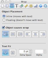
 6. With the borders of the text box still showing, open the Inspector (from the Pages toolbar or from View > Inspector) and choose Wrap Inspector, the third icon from the left.
7. For Object Placement, select "Inline (moves with text)."
8. Check "Object causes wrap" and select the icon on the far left.
9. For Text Fit, select the icon on the left. Change the Extra Space setting to 0. (You might experiment later.)
10. Now position the text box in your document. Depending upon the letter (or numeral) you're dropping in, you might need to tinker by changing Object Placement to Floating and moving your text box (then switching back to Inline). Or you might need to change the Extra Space setting. Getting things right here may prove tedious. But I think that the drop-cap effect is worth the effort.
Drop numerals are ok - but think about where you'd use them. Again, less can sometimes be more.

No comments:
Post a Comment